In a couple of months (March to be exact) we’ll hit the 5th Year Anniversary of RPG Vienna. A lot has happened in that time and while we still remain a small community, I’m very proud of the site and what you’ve all achieved.
However, the current forum platform (phpBB) has become quite long in the tooth. It’s slow, hard to maintain and fairly insecure. Not to mention that the format itself doesn’t really foster much discussion.
After much research and deliberation, I’ve settled on a forum software called Discourse. It’s modern, easy to use and contains a lot more features than phpBB. I plan to move the current forum to Discourse in the next few weeks!
What does this mean for you? well, your user/posts/pm’s will be automatically migrated over to the new forum. Passwords should also work, however if they don’t. you can simply reset the password and the new forum will email you a new one.
Right now, I’ve set up a test server at www.rpgvienna.com) until I announce the proper changeover, at which point I’ll make another backup of the phpBB and migrate it over to the new site.
I would appreciate some feedback though, good or bad (and you can PM me privately, if you wish)
Here’s to the next 5 years!
all the best and Happy Christmas,
Neil.
Right now, it seems to be lacking the structure of the old forum. It seems a bit messy. The threads appear to be classified by date, which is not bad, I generally use the “Active topic” function here, but it might make finding an old post harder…
Similarly, the divisions between posts are not very clear, making it difficult to see when a post ends and another starts
I know that kind of forum from other sites like Syrinscape for example. And as Simon pointed out it can get a bit messy.
A distinction between lines (topics) would be nice. Like an alternating background color. And maybe paging instead of scrolling?
I have to admit that I do like the current forum for its simplicity but if the new one is the same as the one I know then it does have some neat features indeed.
[quote=“Simon”]Right now, it seems to be lacking the structure of the old forum. It seems a bit messy. The threads appear to be classified by date, which is not bad, I generally use the “Active topic” function here, but it might make finding an old post harder…
Similarly, the divisions between posts are not very clear, making it difficult to see when a post ends and another starts[/quote]
Thanks for the reply Simon!
I see your point about looking a bit messy. You can click Categories along the top to get to a view that’s similar to the current one. I’ll also look at improving the boundaries between posts. Everything on that test forum right now is pure default. I haven’t done any work on the presentation.
[quote=“-H-”]As the group’s resident old fogey, I approve any effort to make this site look more like Yahoo! c. 1996.
Just kidding, Neil, I know it’s going to be awesome. [/quote]
H, If the new site is Yahoo, that makes the current one Geocities!
PhpBB 3 was released in 2007. This forum tech is 10 years old. One of the reasons for moving to a new platform was an email last week from my hosting provider saying that they’re going to start charging me extra for using the current version of PHP. There’s a good chance the forum will break if I update PHP, so I took this as a much needed kick up the ass to move on (and also to quit the current provider! )
I realise the new layout is fairly stark and clinical, but that can be fixed. And fixed it shall be!
[quote=“Thopthes”]I know that kind of forum from other sites like Syrinscape for example. And as Simon pointed out it can get a bit messy.
A distinction between lines (topics) would be nice. Like an alternating background color. And maybe paging instead of scrolling?
I have to admit that I do like the current forum for its simplicity but if the new one is the same as the one I know then it does have some neat features indeed.
Thanks for the reply Thoptes!
The forum you linked to is indeed the same platform that we’re moving to. Nice to hear from someone who has experienced the new features! Like I said, I’ll take a look at some ways to improve the presentation.
I know change is always a pain in the beginning, but I’m just asking people to keep an open mind and give the new forum style a go.
[quote=“Neil”][quote=“-H-”]As the group’s resident old fogey, I approve any effort to make this site look more like Yahoo! c. 1996.
Just kidding, Neil, I know it’s going to be awesome. [/quote]
H, If the new site is Yahoo, that makes the current one Geocities! [/quote]
Hey, I wasn’t complaining. I’m all over mid-90s aesthetics. Tying a flannel shirt around my waist as we speak …
All joshing aside, all your work on this site is appreciated. Now you just need to start dropping in more often on Thursdays to reap the benefits of your labor!
I realise the new layout is fairly stark and clinical, but that can be fixed. And fixed it shall be!
I don’t really mind, personally, the current layout is fairly easy to read and, presumably, it should load faster on a smartphone…
Some things will need a bit of getting used to but I can not see anything deal breaking… Just one thing I noticed is that, in the category section, the “Site feedback” and “General RPG discussion” have the same colour. I also think that the site feedback might be move all the way back to the bottom, as I would imagine that it will be the least used subsection. That should help with the colour coding too as the two section of the same colour won’t be adjacent anymore…
Cheers @Simon and thanks for the feedback! You are indeed correct about the category colour. I’ve just changed the colour coding to help.
The list of Categories is dynamic depending on which category was posted in last. Hopefully over the next coming weeks, enough posts will be made to bump that category down to the bottom where it belongs
The option is there to fix the ordering of the categories, but I’ll leave it like it is for a while and see what happens.
Once again, thanks for the support mate!
EDIT: Just between you and me, I don’t think @H likes it too much…
I’m with you on this one. Discourse really doesn’t have much in the way of plugins (which is both a blessing and a curse) but I did try to search for one before the upgrade.
Maybe it would be possible to add them as an overlay on the avatar - it is apparently possible to add them based on group (but that would mean requiring a group per country):
So, I made a plugin for this!
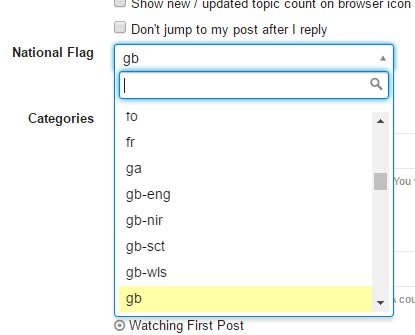
if you go into Settings up there in the top right, you’ll see a drop down where you can select your flags ISO code. e.g. gb, us, es etc. please give it a try
 and thanks for the feedback! You are indeed correct about the category colour. I’ve just changed the colour coding to help.